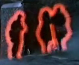
The Red Target Outline is a glowing border around monsters that helps the player see what they're targeting on the busy screens of Diablo III. It's been something of a controversial feature since some players thought (from the gameplay videos) that the line was too bright/thick and distracting.
Blizzcon 2009 Debut
One of the surprise controversies of Blizzcon 2009 was the red target outline. A new feature just added to the game was a glowing red outline around the monster being pointed at. This outline was meant to help players identify what they were pointing at on the frequently-crowded and chaotic battle screens of Diablo 3. Most players didn't mind or didn't even notice while playing at the show, but for some at Blizzcon, and for many others viewing screenshots and gameplay movies over the Internet, the red outline was bright and too obvious and distracting.
This became a minor issue of contention, but the D3 Team is very strongly behind the inclusion of the feature, as Jay Wilson made quite clear during an October, 2009 interview. [1]
- Jay Wilson: I consider it absolutely essential for target selection. We tried tons of other systems, and that’s the one that worked really well. The complaint we get is that it makes the monsters pop out from the world, and our response is that’s exactly what it’s supposed to do.
Julian Love also commented on this, in October 2009. [2]
- DS: while talking to some of the artists when visiting Blizzard HQ during Blizzcon they weren't too sure about the red outline on the mobs or bad guys whenever you mouse over them. Can you talk about that or any of other changes you've made since Blizzcon in direct reference to the feedback you received from fans?
- Julian Love: Yeah, actually the red outline is still something we're adjusting, at this point I don't think we have too many plans of changing it. I wouldn't say that it's finished. The thing that we're looking at with the red outline specifically is to find that balance of player selection notification relative to different levels of combat. We want to make sure it's working while you're engaged with a lot of mobs, while at the same time maybe not being so loud while you're fighting with just a few. It's a matter of adjusting that balance over time till we get it where we feel it's just right. Definitely the tendency there is to error on the side of supporting gameplay and making sure that the game responds really well.
- In terms of the changes that we've made since Blizzard, that we've really been working on lately along those lines have been towards player feedback in combat specifically. One of them being your ability to read when your health is low and another one is to pump up your ability to feel physical hits. Impacts didn't really have a lot going on and we felt that a lot of people were hitting monsters but not really feeling it. So we're taking a look at that right now.
Red Outline Inspiration?
Blizzard has not commented on the occasional allegations that they got this concept from the 1980s Ready Brek commercials. An example screenshot can be seen to the side... you decide!
- Ready Brek ad.
- Lots more of them on YouTube.
